Part 3: KPIs for detailed review
Farms addressing KPIs can improve overall efficiency and success of operations.
This is the third article in our series looking at KPIs (Key Performance Indicators). The first one, titled “Part 1: Looking at KPIs in more detail” was published January 6, 2021, and “Part 2: KPIs for detailed review” was published February 3, 2021. In this article, we review the last three KPIs: piglet survival percentage, total born/female farrowed-P1, total born/female farrowed (P1+P2+ P3) and then review the SMS Production Index that uses the 11 KPIs we have been talking about. The data set for the three articles comes from 572 farms with a total of 1,064,703 mated females. Farms ranged in size from less than 500 mated females to 5,500-plus females. Production ranges from 23 to 34-plus pigs weaned/mated female/year. The farms use genetics from all the major genetic companies with farms located in the U.S. and Canada.
As a reminder, I have listed the 11 KPIs that were used for the three articles:
Pigs weaned/mated female/year
Total born/mated female/year
Piglet survival (100% - stillborns percentage - pre-weaning mortality percentage)
Litters/mated female/year
Wean-to-first service interval days *
Farrowing rate percentage
Female death loss percentage *
Gilt farrowing rate percentage
Total born/female farrowed (P1+P2+P3)
Total born/female farrowed (P1)
Retention (100% - (P1+P2+P3 culls & death loss))
Chart 1 shows piglet survival percentage versus pigs weaned/mated female/year, which was designed to look at saving pigs in farrowing. As a review, the equation for piglet survival = (100-stillborn pigs percentage - pre-weaning mortality percentage). This number was put together a few years ago to address the issue of how dead pigs were classified in farrowing as a stillborn or death of a live pig. We know that by making some changes to farrowing house management, the farm can lower stillborn pigs and pre-weaning mortality, which means improving piglet survival.
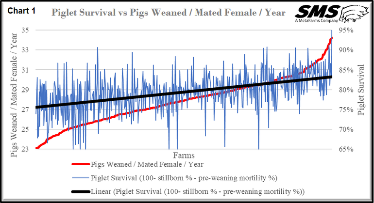
The Chart is laid out with the 572 individual farms on the X-axis, pigs weaned/mated female/year (red line) on the left Y-axis with range from 23-35 pigs and piglet survival percentage (blue line) on the right Y-axis going from 65% to 95%. As you observe, the linear line, which represents piglet survival (black line), is going up. This indicates that pigs weaned/mated female is improving. However, you do see a lot of variation in piglet survival (blue line) among the 572 farms, with a range of less than 65% to 93%.
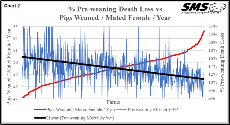
Since this KPI is a combination of stillborn pigs and pre-mortality (pre-weaning death loss) percentage, we did break them out. Chart 2 explores the percentage of pre-weaning death loss versus pigs weaned/mated female/year. It is set up with farms on the x-axis, pigs weaned/mated female/year (red line) on the left y-axis and percentage pre-weaning death loss (blue line) on the right y-axis, with a range of 6-24%. The linear black line (pre-weaning death loss percentage) shows that as pre-weaning death loss percentage goes down, pigs weaned/mated female/year goes up. This number has a large impact saving more pigs in farrowing. Farm that makes changes to day-one pig care in farrowing can save more pigs. This may include extending farrowing hours or adding staff to be checking sows farrowing every 20-30 minutes.
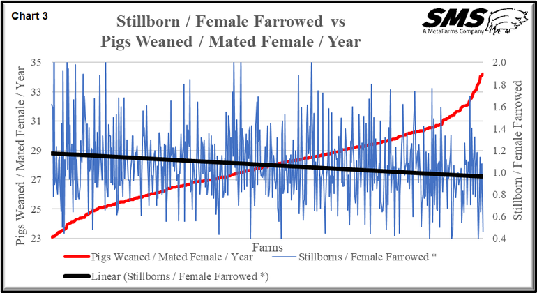
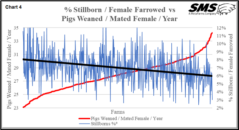
In looking at stillborn pigs, we used two different way of breaking out the data. Chart 3 shows stillborn (pigs/litter)/female farrowed versus pigs weaned/mated female/year, and Chart 4 shows percentage of stillborns/female farrowed versus pigs weaned/mated female/year. The Charts are set up the same with farms on the x-axis, pigs weaned/mated female/year in the left y-axis and stillborn and percentage of stillborns/female farrowed on the left y-axis. Both Charts are the same showing as stillborn or percentage of stillborns/female farrowed goes up pigs weaned/mated female/year goes down. I prefer using stillborn (pigs/litter)/female farrowed when reviewing farm data since a definite number like 1.2 stillborns per litter is more informative than the percentage of total born. If a farm has a higher total born, the percentage does not reflect how many stillborns/female farrowed.
When a farm is looking to improve total pigs born, it is necessary to start by looking at total born for P1 females. We know that her first litter does influence her lifetime performance. Chart 5 explores parity 1 total born/female farrowed versus pigs weaned/mated female/year of the first litter. The Chart is set up with farms on the x-axis, pigs weaned/mated female/year (red line) on left y-axis and total born/female farrowed (blue line) on right y-axis with range of 12-18 pigs. The trend line (black linear line) shows that as total born for P1s goes up, it increases pigs weaned/mated female/year. There are some farms in the SMS data base with P1 at 15-plus total born.
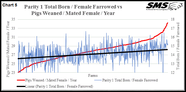
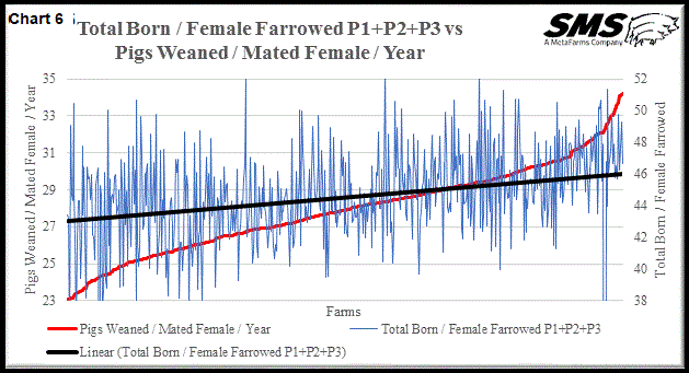
Chart 6 looks at total born/female farrowed P1+ P2+ P3 versus pigs weaned/mated female/year. The chart looks at the first three parities of females to see if total born increases with each parity. However, there are farms that see the P2 slump—a lower total born for that litter—which affects the P3 total. Chart 6 is set up with farms on the x-axis, pigs weaned/mated female/year (red line) on left y-axis and total born/female farrowed (blue line) on the right y-axis, with a range of 38 to 52 total pigs for the first 3 litters. The linear black trend line shows that as total born for the three litters goes up, so does pigs weaned/mated female/year.
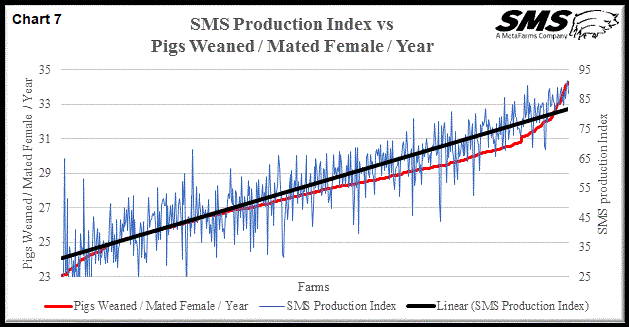
When we first stated the farm benchmarking, we only used a standard equation for pigs weaned/mated female/year. We then started getting comments that maybe there needed to be an index made up of several production numbers. So, we started looking at numbers that influence pigs weaned/mated female/year. This has grown over time to the 11 KPIs we use in the current index. To validate the index, we include Chart 7, which looks at SMS Production Index versus pigs weaned/mated female/year. The 572 farms on the x-axis, pigs weaned/mated female/year (red line) on the left y-axis and SMS production index (blue line) on the right y-axis, with range of 25-95. As you can see, there is a very good parallel with pigs weaned/mated female/year and the index which validates the 11 KPIs used in the index and how we rank each KPI.
How should your group be using the KPIs? Unless you are working with SMS using our benchmarking program with the 11 KPIs, your farm management and staff need to review this three-part series of articles. After you have completed this as a group, you need to pick a few KPIs that your farm should be working on.
To get some idea of how your farm compares to the industry, we have attached Table 1, which explores SMS farm benchmarking. This table is updated monthly for the articles we write for National Hog Farmer. On average, there are 900-plus sow farms with 1.7-plus mated females in the table. The farms are located mainly in the U.S. and Canada, with a small subset from Australia. The table is set up with five percentile categories: 90-100 (top 105), 70-90 (next 20%), 60-70, 30-50 and 0-30 (lower 30% of the farms). You will see the 11 KPIs are in the left column with production numbers for each percentile. There are also columns for all averages, last 13- and 26-weeks averages and the last 12 quarters averages. Remember that each percentile column is the average of the farms in that column. For example, in the 90-100 (top 10%) the average for the 95 sows farm for pigs weaned/mated female/year at 32.18 pig, farrowing rate at 90.2% and piglet survival at 84.0%.
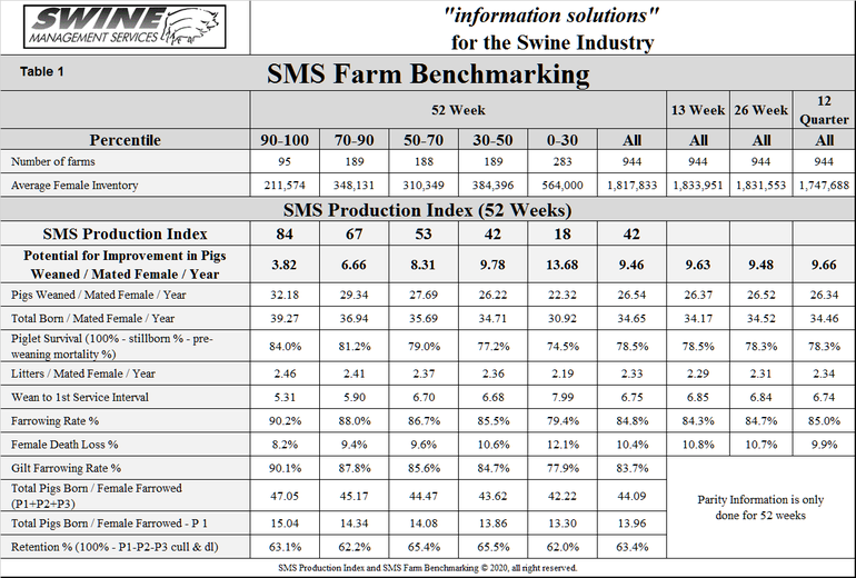
This table should give you some production numbers to compare your farm to and then be able to establish and monitor the KPIs you select for your targets. If you are not using the SMS index, we suggest you start with three numbers: farrowing rate, female death loss and piglet survival. To improve each of these three production numbers by one pig per mated female per year, you need to improve farrowing rate by 3%, lower female death loss by 4% and improve piglet survival by 3%.
How does your farm compare to the SMS data base? What are your targets of 2021?
What KPIs are you going to track? In next month’s article, we will be looking at KPIs for the finisher area to complete the review of KPIs.
Table 1 provides the 52-week rolling averages for the 11 production numbers represented in the SMS Production Index. The numbers are separated by 90-100%, the 70-90%, the 50-70%, the 30-50% and the 0-30% groups. We also included the 13-week, 26-week, and 12-quarter averages. These numbers represent, what we feel, are the key production numbers to properly evaluate a farm’s performance.
At SMS, our mission statement is to provide “information solutions for the swine industry.” We feel with the creation of different SMS Benchmarking databases for all production areas, we now have more detailed information to share with the swine industry. If your farm would like to be part of the SMS Benchmarking databases, or if you have suggestions on production areas to write articles about, please e-mail or call us.
If you have questions or comments about these columns, or if you have a specific performance measurement that you would like us to write about, please contact: [email protected], [email protected] or [email protected]
Sources: Ron Ketchem, Mark Rix, and Connor Sharp, with Swine Management Service LLC, are solely responsible for the information provided, and wholly own the information. Informa Business Media and all its subsidiaries are not responsible for any of the content contained in this information asset.
About the Author(s)
You May Also Like


