SMS database shows top 10% of the farms have a favorable trend line for death loss while the database as a whole has an unfavorable trend line. Overall death loss was actually lowered each year from 2006 to 2010 before it was steady until 2014 and then jumping up in 2015 to 8.6% and finishing 2016 at 10.2%.
Over the next two months, we are going to share information we have pulled from our database in regards to herd fallout for the DSM Pork Nexus conference that was held at North Carolina State University in May. This month we are going to focus on some trends in the data. Next month we will talk about the major reasons contributing to fallout and the variation between systems.
What does the trend look like for death loss over the last 11 years? It is shown in Chart 1. The top 10% of the farms have a favorable trend line for death loss while the database as a whole has an unfavorable trend line. Overall death loss was actually lowered each year from 2006 to 2010 before it was steady until 2014 and then jumping up in 2015 to 8.6% and finishing 2016 at 10.2%. Why has death loss continued to rise over the last several years? Is it because more productive females are under more stress, because individual pig care isn’t focused on in some units, or because we are treating less because that is what consumers want?
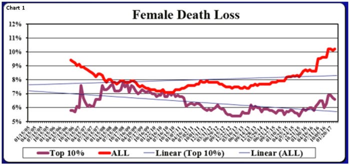
Chart 2 shows that over the last 52 weeks there have been farms in the Swine Management Services dataset at less than 2% for the year while there have been others at more than 22% with the average at 10.4% for the last 52 weeks. That was 210 of the 898 farms or 23.4% with female death loss at 12+% for the last 52 weeks.
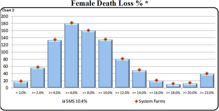
Chart 2 shows that over the last 52 weeks there have been farms in the Swine Management Services dataset at less than 2% for the year while there have been others at more than 22% with the average at 10.4% for the last 52 weeks. That was 210 of the 898 farms or 23.4% with female death loss at 12+% for the last 52 weeks.
In Chart 3 we look at 893 farms with 1,492,900 sows, and for the last 12 months broke out the percent of culls and deaths by size of farms. Of the five subsets based on size of operation those who have 1,000-2,999 sows along with more than 4,000 sows have death losses at or above 10% on average. The farms with less than 1,000 sows have the lowest death loss at 6.5%. While operations between 3,000 and 3,999 sows have the lowest combined death loss and cull rate at a combined 51.8%.
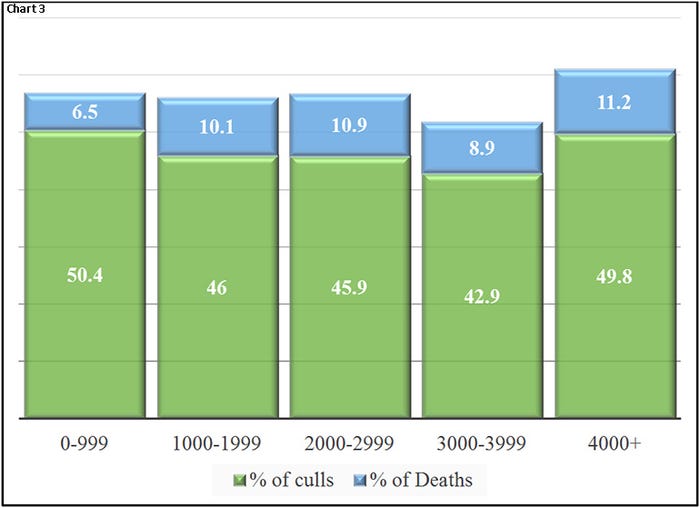
Chart 3: Looks at 893 farms with 1.492 million sows, and for the last 12 months broke out the percent of culls and deaths by size of farms.
In Table 1 from a column we wrote in 2012 for National Hog Farmer it shows that there was less than a 1% difference in sow death loss regardless of housing, those in crates were at 7.5% while pens were at 6.8% and electronic sow feeding barns were at 7.7%. We plan to conduct this again later this year as we have added several more ESF operations in the last five years. If you are interested in participating in this study please contact us and we will discuss it further with you.
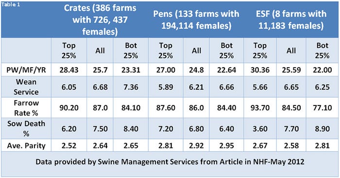
Table 1: From a column in 2012 National Hog Farmer showing there was less than a 1% difference in sow death loss regardless of housing, those in crates were at 7.5% while pens were at 6.8% and electronic sow feeding barns were at 7.7%.
Table 2 provides the 52-week rolling averages for 11 production numbers represented in the SMS Production Index. The numbers are separated by 90-100%, the 70-90%, the 50-70%, the 30-50%, and the 0-30% groups. We also included the 13-week, 26-week and 12-quarter averages. These numbers represent what we feel are the key production numbers to look at to evaluate the farm’s performance. Take a look at the row “Female Death Loss %” at the farms in the 90-110 percentiles at 6.4% to farms in the 0-30 percentile at 13.5%.
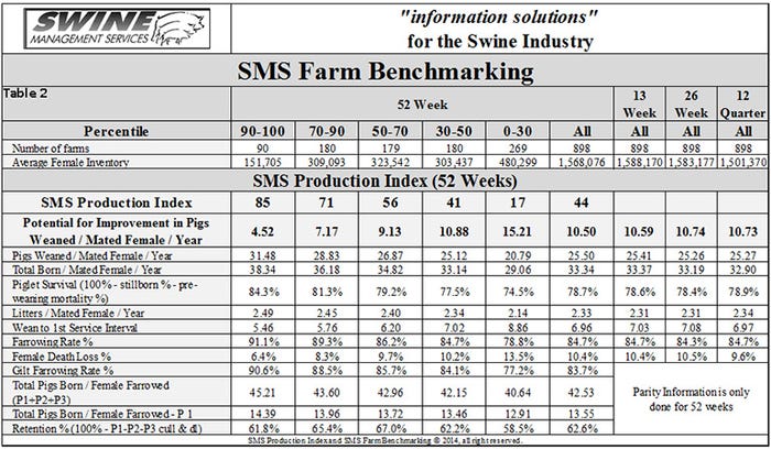
Table 2: 52-week rolling averages for 11 production numbers represented in the SMS Production Index.
Next month we will share some of the most common death loss reasons, however, the increased incidence of prolapses is certainly a contributing factor to the increase over the last year.
What does all of this tell us? As we continue to improve productivity of operations we cannot forget the importance of individual animal care. The costs of losing sows are real and need to be looked at by each operation to see what can be done to minimize those losses. Is your farm dealing with increasing female death loss and culling? What are you plans to fix the problems?
At SMS, our mission statement is to provide “Information solutions for the swine industry.” We feel with the creation of different SMS Benchmarking databases for all production areas we now have more detailed information to share with the swine industry. If your farm would like to be part of the SMS Benchmarking databases, or if you have suggestions on production areas to write columns about, please contact us at [email protected], [email protected] or [email protected]. We enjoy being a part of the National Hog Farmer Weekly Preview team. Previous Production Preview columns can be found at NationalHogFarmer.com.
About the Author(s)
You May Also Like
